Using the Web Components UI
Here, we’ll demonstrate how to get it working in the simplest way using JavaScript, npm, and vite (instructions for installing and using npm and vite are beyond the scope of this document). Follow these instructions to get it working on your system:
Minimal Setup
- Create a new vite project using
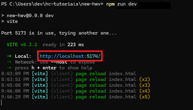
npm create vite@latest. In the vite install script, follow the prompts to enter a name for the app, choose “Vanilla”, then JavaScript. - After the project is created, run
npm installandnpm run dev. Note the localhost address that will be provided to you by Vite.
Delete index.html, the src folder, as well as all the files in the public folder.
In the root directory, create a new index.html.
Install the web viewer components using one of the following methods:
Option A: Direct npm installation
- Run
npm install @ts3d-hoops/web-viewer-components
Option B: Local installation from customer package
- Create a folder called @ts3d-hoops in the root directory
- Locate INSTALL_DIR/web_viewer/@ts3d-hoops and copy all folders (except beta-demo-app-src) to your new @ts3d-hoops folder
- Run
npm install "./@ts3d-hoops/web-viewer-components"in a command prompt from your project directory
- Run
Copy any .scs file to the public folder of this new project. Sample files can be found in INSTALL_DIR/quick_start/converted_models/standard/scs_models. In this example, we will use microengine.scs.
Setup the WebAssembly engine files based on your installation method:
Option A: With npm installation
- Copy engine.esm.wasm from node_modules/@ts3d-hoops/sc-engine/ to your public folder
- Alternatively, configure your bundler (Vite, Webpack, etc.) to automatically copy the engine files during build
Option B: With local installation
- Copy engine.esm.wasm from ./@ts3d-hoops/sc-engine to the public folder
Inside your new index.html, create a basic HTML structure with the minimal setup in the
<body>:
<!DOCTYPE html>
<html lang="en">
    <head>
        <meta charset="UTF-8" />
        <meta name="viewport" content="width=device-width, initial-scale=1.0" />
        <title>HOOPS Web components</title>
    </head>
    <body>
        <hoops-service-registry>
            <hoops-web-viewer-context-manager>
                <hoops-web-viewer id="hwv" endPointUri="./microengine.scs"></hoops-web-viewer>
            </hoops-web-viewer-context-manager>
        </hoops-service-registry>

        <script type="module">
            import "@ts3d-hoops/web-viewer-components";
        </script>
    </body>
</html>
The minimal setup includes the <hoops-service-registry> and <hoops-web-viewer-context-manager> components, which are required for the other components to function properly.
The <hoops-web-viewer> component is the actual viewer itself.
The import statement is necessary to register the web components into the application.
- For the
endPointUrivalue, replace the filename with the .scs file you copied to the public directory.
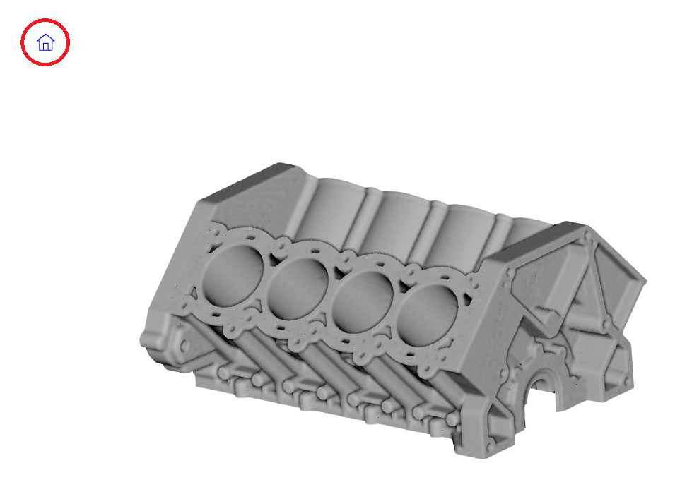
After navigating to the address generated by vite in step 2, you should see a model in your browser.
Adding a Self-Contained Component
The HOOPS UI comes with some predefined web components that are self-contained and ready to use. These components can be added to your application as is and will work without any additional logic as soon as they are inside the service registry and context manager scope.
We will add a <hoops-toolbar-home> component to your application.
It’s a simple component that displays a home icon button.
When the button is clicked, it resets the view to the default orientation.
Logic is already implemented in the component itself, interaction with the Web Viewer is done with the context manager.
Add the following HTML to the body of index.html, right after the <hoops-web-viewer> tag:
 <hoops-service-registry>
     <hoops-web-viewer-context-manager>
         <hoops-web-viewer id="hwv" endPointUri="./microengine.scs"></hoops-web-viewer>
+        <div style="position: absolute; top: 10px; left: 10px">
+            <hoops-toolbar-home></hoops-toolbar-home>
+        </div>
     </hoops-web-viewer-context-manager>
 </hoops-service-registry>
The list of all components available in the HOOPS UI can be found in the API reference.
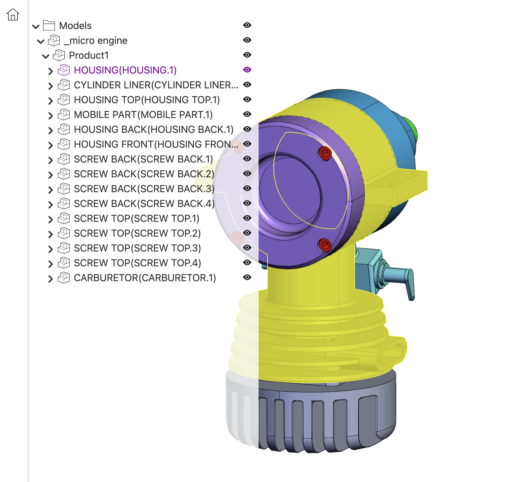
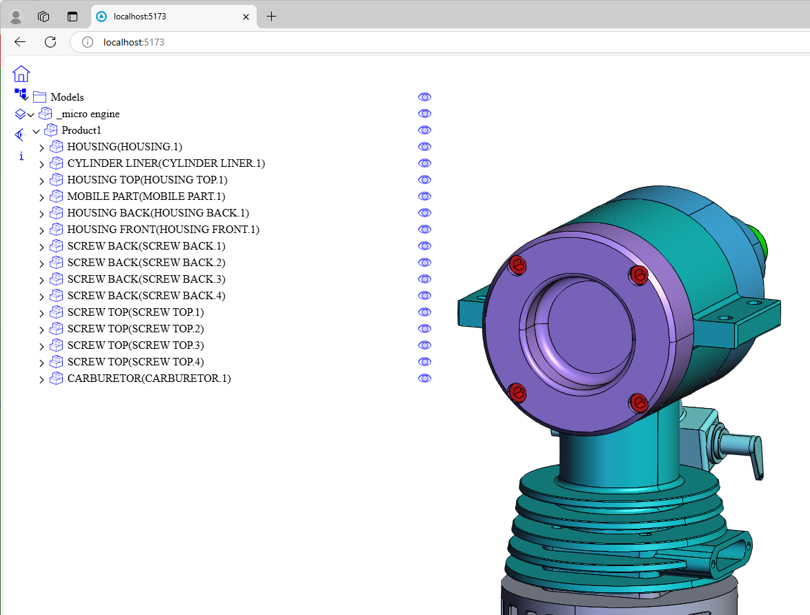
Using the Model Tree
We will add a model tree component to the application to display the assembly structure and its attributes in a hierarchical view.
The tree can be expanded and collapsed, and the visibility of individual components can be toggled.
It is provided as a web component with the HTML tag <hoops-model-tree>.
Some components like the model tree may require additional logic to be fully functional. The component will trigger HTML events that you can listen to and respond to accordingly.
To use it, you need to add the model tree to your application and assign it an id.
 <hoops-service-registry>
     <hoops-web-viewer-context-manager>
         <hoops-web-viewer id="hwv" endPointUri="./microengine.scs"></hoops-web-viewer>
         <div style="position: absolute; top: 10px; left: 10px">
             <hoops-toolbar-home></hoops-toolbar-home>
         </div>
+        <div style="position: absolute; top: 50px; left: 10px; width: 400px">
+            <hoops-model-tree id="hwvModelTree"></hoops-model-tree>
+        </div>
     </hoops-web-viewer-context-manager>
 </hoops-service-registry>
Then, we will bind the web viewer’s model to the model tree when ready.
Add the following code to your <script> tag in index.html:
 <script type="module">
     import "@ts3d-hoops/web-viewer-components";
+
+    const webViewerComponent = document.getElementById("hwv");
+    const modelTreeComponent = document.getElementById("hwvModelTree");
+
+    webViewerComponent.addEventListener("hwvModelStructureReady", (e) => {
+        const webViewer = e.detail.hwv;
+        modelTreeComponent.model = webViewer.model;
+    });
 </script>
The model tree will now display the structure of the loaded model, nodes can be expanded and collapsed. However, it isn’t yet interactive. Nothing happens when you click on a node or the visibility icon.
The component emits events when nodes are clicked or their visibility is toggled.
You can listen to these events and implement the desired behavior.
Continuing from the code above, add the following in the hwvModelStructureReady callback:
 <script type="module">
     import "@ts3d-hoops/web-viewer-components";
+    import { SelectionMode } from "@ts3d-hoops/web-viewer";

     const webViewerComponent = document.getElementById("hwv");
     const modelTreeComponent = document.getElementById("hwvModelTree");

     webViewerComponent.addEventListener("hwvModelStructureReady", (e) => {
         const webViewer = e.detail.hwv;
         modelTreeComponent.model = webViewer.model;
+
+        modelTreeComponent.addEventListener(
+            "hoops-model-tree-node-click",
+            (e) => {
+                const selectionManager = webViewer.selectionManager;
+                selectionManager.clear(false);
+                selectionManager.selectNode(e.detail.nodeId, SelectionMode.Add);
+            }
+        );
     });
 </script>
Notice the call to selectNode. This is what enables you to click a component in the model tree and automatically select the associated part in the model.
We now need to bind the other side of the interaction - when a part is selected in the model, the corresponding node in the tree should be highlighted. Add the following code in the same callback:
 webViewerComponent.addEventListener("hwvModelStructureReady", (e) => {
     const webViewer = e.detail.hwv;
     modelTreeComponent.model = webViewer.model;

     modelTreeComponent.addEventListener(
         "hoops-model-tree-node-click",
         (e) => {
             const selectionManager = webViewer.selectionManager;
             selectionManager.clear(false);
             selectionManager.selectNode(e.detail.nodeId, SelectionMode.Add);
         }
     );
+
+    webViewerComponent.addEventListener("hwvSelectionArray", (e) => {
+        const nodeIds = e.detail.selectionEvents.map((event) =>
+            event.getSelection().getNodeId()
+        );
+        modelTreeComponent.selected = nodeIds;
+    });
 });
Finally, we’ll bind the visibility as we did with selection.
Add the following event listener in the hwvModelStructureReady callback:
 webViewerComponent.addEventListener("hwvModelStructureReady", (e) => {
     const webViewer = e.detail.hwv;
     modelTreeComponent.model = webViewer.model;

     modelTreeComponent.addEventListener(
         "hoops-model-tree-node-click",
         (e) => {
             const selectionManager = webViewer.selectionManager;
             selectionManager.clear(false);
             selectionManager.selectNode(e.detail.nodeId, SelectionMode.Add);
         }
     );

     webViewerComponent.addEventListener("hwvSelectionArray", (e) => {
         const nodeIds = e.detail.selectionEvents.map((event) =>
             event.getSelection().getNodeId()
         );
         modelTreeComponent.selected = nodeIds;
     });
+
+    modelTreeComponent.addEventListener(
+        "hoops-model-tree-node-visibility-change",
+        (e) => {
+            e.stopPropagation();
+            webViewer.model.setNodesVisibility(
+                [e.detail.nodeId],
+                e.detail.visibility
+            );
+            modelTreeComponent.updateNodeData(e.detail.nodeId, {
+                visible: e.detail.visibility,
+            });
+        }
+    );
 });
Now, the model is selectable and its parts can be shown and hidden.
Note
You need to update the tree if it changes from the Web Viewer. To update the entire tree, you can simply reassign the model to the tree. The underlying framework will detect a change in the model and update the tree automatically.
The list of all components available in the HOOPS UI can be found in the API reference.
HOOPS Layout
The HOOPS UI also includes a UI kit with various components and a layout system to arrange them on the page and help you quickly build and prototype a complete application.
We will add a layout component to organize the application.
The <hoops-layout> tag is a container to organize other components through slots (such as a menu bar, toolbars, panels, and a central widget).
For the complete list of available slots, please refer to the API reference.
To implement this in the code, you have to instantiate a hoops-layout, create a component inside of it, and have its slot set to one of the above options.
Your component should be placed accordingly in the layout.
With this added, the full body should looks like:
 <body>
     <hoops-service-registry>
         <hoops-web-viewer-context-manager>
-            <hoops-web-viewer id="hwv" endPointUri="./microengine.scs"></hoops-web-viewer>
-            <div style="position: absolute; top: 10px; left: 10px">
-                <hoops-toolbar-home></hoops-toolbar-home>
-            </div>
-            <div style="position: absolute; top: 50px; left: 10px; width: 400px">
-                <hoops-model-tree id="hwvModelTree"></hoops-model-tree>
-            </div>
+            <hoops-layout floatingPanels>
+                <div id="toolbar" slot="toolbar-left">
+                    <hoops-toolbar-home></hoops-toolbar-home>
+                </div>
+                <div id="leftPanel" slot="panel-left">
+                    <hoops-model-tree id="hwvModelTree"></hoops-model-tree>
+                </div>
+                <div slot="central-widget">
+                    <hoops-web-viewer id="hwv" endPointUri="./microengine.scs">
+                    </hoops-web-viewer>
+                </div>
+            </hoops-layout>
         </hoops-web-viewer-context-manager>
     </hoops-service-registry>
The list of all UI components available in the HOOPS UI can be found in the API reference.
Customizing the Appearance
The style of most HOOPS UI web components is defined using a set of CSS variables that can be customized.
You can change size, colors, and other visual aspects of the components to match your application’s design.
Create a <style> tag in the index.html file and add the following to improve the application’s style with a different color palette.
 <!DOCTYPE html>
     <html lang="en">
     <head>
         <meta charset="UTF-8" />
         <meta name="viewport" content="width=device-width, initial-scale=1.0" />
         <title>ui-prog-guide</title>
+        <style>
+            body {
+                margin: 0;
+                font-family: system-ui, -apple-system, BlinkMacSystemFont, "Segoe UI",
+                Roboto, Oxygen, Ubuntu, Cantarell, "Open Sans", "Helvetica Neue",
+                sans-serif;
+                color: #333333;
+
+                --hoops-sm-icon-button-size: 2rem;
+                --hoops-sm-icon-button-content-size: 1.3rem;
+
+                --hoops-neutral-foreground: #333333;
+                --hoops-neutral-background-hover: #8300a0;
+                --hoops-accent-foreground-hover: #8300a0;
+                --hoops-neutral-foreground-active: #a0a0a0;
+            }
+
+            hoops-web-viewer {
+                width: 100%;
+                height: 100%;
+            }
+
+            hoops-model-tree {
+                padding-top: 2rem;
+                background-color: rgba(255, 255, 255, 0.8);
+                height: 100vh;
+            }
+
+            #toolbar {
+                padding: 0.5rem;
+                border-right: 1px solid #ccc;
+            }
+        </style>
     </head>
A list of all CSS variables can be found here.