Web Components Reference
Viewer and Utilities Tags
-
<hoops-web-viewer> Encapsulated HOOPS Web Viewer component within an HTML tag. It provides a seamless way to integrate the viewer into your web application.
Attributes
All fields in the
WebViewerConfigobject can be set as attributes on the tag.The complete list of attributes is as follows:
EndpointUri: string - Specifies the endpoint to be used by the viewer. This can be of type http, https or ws. Model: string - Specifies the instance name to be loaded. This option is required if you specify an endpointUri of type ws:// or wss://. SessionToken: string - An arbitrary value used for authentication. If used, it must match the token expected by the server for connection to proceed. RendererType: string - Specifies the renderer type to be used. Default value is Client. Use “server” to use server conversion. Any other value will perform file conversion on the client. Empty: boolean - Whether the viewer should be started without connecting to a server or loading a model. UsePointerEvents: boolean - Specifies whether pointer events should be used when available. Setting this option to false can be useful when using web views in GUI toolkits that rely on Internet Explorer. Default value is true. StreamingMode: string - Sets the streaming mode that the viewer will use. Default value is Interactive. MemoryLimit: number - Controls the amount of mesh data present on the client machine at a given time. This value is expressed in Mebibytes (https://en.wikipedia.org/wiki/Mebibyte). Default value is 0 indicating no limit. BoundingPreviewMode: string - Specifies what types of bounding previews should be rendered. Default value is All. DefaultMeshLevel: number - Specifies which mesh detail level will be used to initially stream the model. The default value is 0. StreamCutoffScale: number - Specifies a scale factor that will be applied to the streaming size cutoff. A value of 0 will disable the cutoff. The value should be in the interval of [0.0, 2.0]. If unspecified, this value will default to 1.0 for streaming sessions and 0.0 (disabled) for file based sessions. DisableAutomaticBackgroundSheets: boolean - If true, then automatic generation of background sheets for drawings is not performed when the drawing is loaded. DisableAutomaticFloorplanOverlay: boolean - If true, then the floorplan overlay capability will not be displayed automatically for BIM enabled models. CalculateDefaultViewAxes: boolean - If true, the default view axes will be calculated from the initial camera unless explicitly set during authoring time. Default value is true. DisableAutomaticFitWorld: boolean - If true, disable automatic fitworld on camera activation when there is no camera on view. EnableShatteredModelUiViews: boolean - If true, then CAD views contained within external models will populate the model tree UI. EnginePath: string - Path containing the graphics engine .wasm files. Follows the same rules as the src attribute of an HTML script tag. DefaultMetallicFactor: number - Sets a default metallic factor that will be applied to ALL non-PBR materials in the scene. Acceptable value range is (0.0 - 1.0). If defaultRoughnessFactor is specified and this value is omitted, a value of 1.0 will be assumed. DefaultRoughnessFactor: number - Sets a default roughness factor that will be applied to ALL non PBR materials in the scene. Acceptable value range is (0.0 - 1.0). If defaultMetallicFactor is specified and this value is omitted, a value of 1.0 will be assumed. The following attributes aren’t exposed:
containerIdcontainerbuffer
Events
All the callbacks available in the
CallbackMapobject used inWebViewer.setCallbacksare available as events in this component. They are prefixed withhwv, for example:hwvAssemblyTreeReadyorhwvCamera.In addition, the following events are available:
- ‘hwvReady’:
CustomEvent<WebViewer>: triggered when the internalWebVieweris created and ready to use.
Attribute: hwv- the Web Viewer object
-
<hoops-model-tree> Displays the AssemblyTree structure. Can be bound to the
WebViewer.model. Events are available for selection and visibility management, enhancing interaction with the model hierarchy.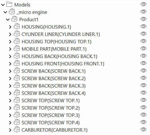
The component has no attributes, but the
HoopsModelTreeElementclass has the following properties to configure and interact with the tree:selected: number[] - The list of selected node ids.model: IModel - The model to be displayed in the tree. This is typically theWebViewer.model.
Events
- ‘hoops-model-tree-node-click’:
ModelTreeNodeClickEvent<{ nodeId: number; source: HTMLElement } & BaseMouseEvent> - ‘hoops-model-tree-node-visibility-change’:
ModelTreeNodeVisibilityClickEvent<{ nodeId: number; visibility: boolean; source: HTMLElement } & BaseMouseEvent>
-
<hoops-layer-tree> Displays the layers from the AssemblyTree with associated nodes. Can be bound to the
WebViewer.model. Events are available for selection and visibility management, allowing for detailed layer control.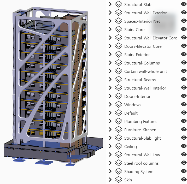
The component doesn’t have any attributes, but the
HoopsLayerTreeElementclass has the following properties to configure and interact with the tree:layersContainer: ILayerContainer - The layers interface to display in the tree. This is typically theWebViewer.model.
Events
- ‘hoops-layer-tree-element-click’:
LayerTreeElementClickEvent<{ layerId: number; source: HTMLElement } & BaseMouseEvent> - ‘hoops-layer-tree-node-selected’:
LayerTreeNodeSelectedEvent<{ layerId: number; source: HTMLElement } & BaseMouseEvent> - ‘hoops-layer-tree-visibility-changed’:
LayerTreeVisibilityChanged<{ layerId: number; source: HTMLElement } & BaseMouseEvent>
-
<hoops-view-tree> Displays the views from the AssemblyTree. Can be bound to the
WebViewer.model. Events are available for selection, facilitating view management.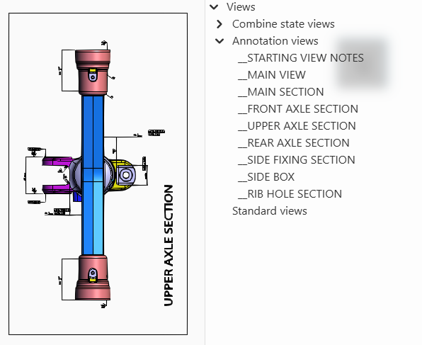
The component has no attributes, but the
HoopsViewTreeElementclass has the following properties to configure and interact with the tree:selected:number[]: The list of selected view ids.model:IModel: The model interface where the views are queried to be displayed in the tree. This is typically theWebViewer.model.
Events
- ‘hoops-view-tree-node-click’:
ViewTreeNodeClickEvent<{ nodeId: number; source: HTMLElement } & BaseMouseEvent>
-
<hoops-web-viewer-context-manager> The context manager is a logical component to synchronize UI web viewer components states around the web viewer.
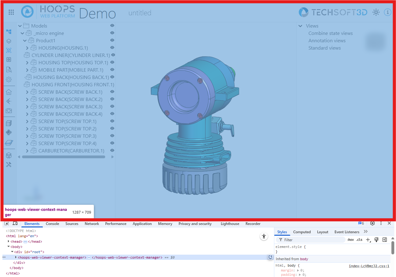
It is an internal component responsible of making changes in the web viewer and store states as a single source of truth. States are propagated using the Context Community Protocol (https://github.com/webcomponents-cg/community-protocols/blob/main/proposals/context.md) by the W3C’s Web Components Community Group.
The
hoops-web-viewer-context-managercomponent must be an ancestor of a UI component to be able to propagate states to it.
-
<hoops-info-button> A button component with default icon for “about” section.

Logic to toggle the visibility of any info panel must be handled by the application with the default ‘click’ event.
Attributes
tabindex: string - The tabindex of the button. Default is ‘0’.role: string - The role of the button, e.g., ‘button’. Default is ‘button’.size: string - The size of the icon. Default is ‘md’.color: ‘default’ | ‘accent’ - The color state of the button. Default is ‘default’.
-
<hoops-cad-configuration-list> A list component that displays the available CAD configurations for the model. It allows users to select a configuration and apply it to the model.
Can be bound to the
WebViewer.model. Event is available for configuration selection.The component doesn’t have any attributes, but the ``HoopsCadConfigurationListElement``class has the following properties to configure the component:
model: IModel - The model interface where the configurations are queried to be displayed. This is typically theWebViewer.model.active: number - The id of the active configuration. undefined if no configuration is active.
Events
- ‘hoops-cad-configuration-list-click’:
CadConfigurationListClickEvent
-
<hoops-context-menu> A context menu component that displays a custom menu at the location of a right-click or context event. It can be used to provide contextual actions for elements in your application.
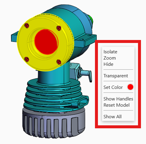
The menu content should be defined in the default slot. The component manages its own visibility and positioning.
Attributes
x: number - The x-coordinate for the context menu position. Default is 0.y: number - The y-coordinate for the context menu position. Default is 0.isolateZoomHelper: IsolateZoomHelper - Helper object for isolate/zoom functionality.activeItemId: string | null - The ID of the currently active item. Default is null.activeLayerName: string | null - The name of the currently active layer. Default is null.activeType: string | null - The type of the currently active item. Default is null.color: string - The color used for the context menu. Default is ‘#ff0000’.model: IContextMenuModel | undefined - The context menu model object. It’s a subset of theWebViewer.model.webViewer: IContextMenuWebViewer | undefined - The web viewer instance associated with the context menu.isUnsettingColor: boolean - Indicates if the color is being unset. Default is false.
Events
- ‘context-menu-item-clicked’:
ContextMenuItemClicked<{ source: HTMLElement } & MouseEvent>: Triggered when an item in the context menu is clicked.
-
<hoops-toolbar-cad-configuration> A button component with default icon that represents CAD configurations.

Logic to toggle the visibility of the CAD configurations must be handled by the application with the default ‘click’ event.
Attributes
color: ‘default’ | ‘accent’ - Color state of the button. Default is ‘default’. It’s usually set to ‘accent’ when the CAD configurations panel is open.
-
<hoops-toolbar-camera-operator> A button component that provides selection of the active camera operator through a dropdown menu.

Link to the
WebVieweris internally established through thehoops-web-viewer-context-manager.Attributes
dropDownPosition: ‘bottom’ | ‘top’ | ‘right’ | ‘left’ - Specifies the position of the dropdown menu relative to the button. Default is ‘right’.
-
<hoops-toolbar-camera> A button component that provides basic camera operations such as projection modes and generic views through a dropdown menu.
Link to the
WebVieweris internally established through thehoops-web-viewer-context-manager.Attributes
dropDownPosition: ‘bottom’ | ‘top’ | ‘right’ | ‘left’ - Specifies the position of the dropdown menu relative to the button. Default is ‘right’.
-
<hoops-toolbar-drawmode> A button component that provides selection of the current draw mode such as “shaded” or “wireframe” through a dropdown menu.

Link to the
WebVieweris internally established through thehoops-web-viewer-context-manager.Attributes
dropDownPosition: ‘bottom’ | ‘top’ | ‘right’ | ‘left’ - Specifies the position of the dropdown menu relative to the button. Default is ‘right’.
-
<hoops-toolbar-explode> A button component that provides control over the explode state of the model through a dropdown menu and a slider.

Link to the
WebViewermust be established by passing theWebViewerinstance to thehoops-toolbar-explodecomponent.Attributes
webViewer: WebViewer - The instance of theWebViewerto which the explode state will be applied.dropDownPosition: ‘bottom’ | ‘top’ | ‘right’ | ‘left’ - Specifies the position of the dropdown menu relative to the button. Default is ‘right’.
-
<hoops-toolbar-home> A button component that provides a basic home button functionality, allowing users to return to a default model state.

Link to the
WebVieweris internally established through thehoops-web-viewer-context-manager.
-
<hoops-toolbar-layers> A button component with default icon that represent layers.
Logic to toggle the visibility of the layers must be handled by the application with the default ‘click’ event.
Attributes
color: ‘default’ | ‘accent’ - Color state of the button. Default is ‘default’. It’s usually set to ‘accent’ when the layer panel is open.
-
<hoops-toolbar-model-tree> A button component with default icon that represents the model tree.

Logic to toggle the visibility of the model tree must be handled by the application with the default ‘click’ event.
Attributes
color: ‘default’ | ‘accent’ - Color state of the button. Default is ‘default’. It’s usually set to ‘accent’ when the model tree is open.
-
<hoops-toolbar-properties> A button component with default icon that represents the properties panel.

Logic to toggle the visibility of the properties panel must be handled by the application with the default ‘click’ event.
Attributes
color: ‘default’ | ‘accent’ - Color state of the button. Default is ‘default’. It’s usually set to ‘accent’ when the properties panel is open.
-
<hoops-toolbar-snapshot> A button component with default icon that represent the snapshot functionality.

Logic to trigger the snapshot must be handled by the application with the default ‘click’ event.
-
<hoops-toolbar-redlines> A button component that provides a minimal UI to select the redlines operators through a dropdown menu.
Link to the
WebVieweris internally established through thehoops-web-viewer-context-manager.Pressing the Escape key will disable the redlines tool and go back to selection mode.
-
<hoops-toolbar-tools> A button component with a default icon representing the tools panel.

Logic to toggle the visibility of the tools panel must be handled by the application with the default ‘click’ event.
Attributes
color: ‘default’ | ‘accent’ - Color state of the button. Default is ‘default’. It’s usually set to ‘accent’ when the tools panel is open.
-
<hoops-toolbar-views> A button component with default icon that represents the views tree.

Logic to toggle the visibility of the views tree must be handled by the application with the default ‘click’ event.
Attributes
color: ‘default’ | ‘accent’ - Color state of the button. Default is ‘default’. It’s usually set to ‘accent’ when the views tree is open.
-
<hoops-toolbar-settings> A button component with default icon that represents the settings panel.
Logic to toggle the visibility of the settings panel must be handled by the application with the default ‘click’ event.
Attributes
color: ‘default’ | ‘accent’ - Color state of the button. Default is ‘default’. It’s usually set to ‘accent’ when the settings panel is open.
-
<hoops-toolbar-types> A button component with default icon that represents the types panel. See
hoops-types-treecomponent.Logic to toggle the visibility of the types panel must be handled by the application with the default ‘click’ event.
Attributes
color: ‘default’ | ‘accent’ - Color state of the button. Default is ‘default’. It’s usually set to ‘accent’ when the types panel is open.
-
<hoops-tools-panel> A panel that contains various sections for most of the operators management:
- selection
- measurements
- redlines
- markups
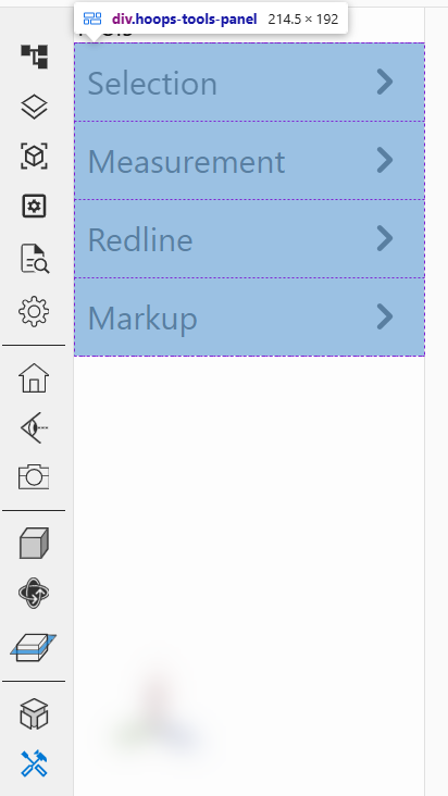
Each section can be instantiated separately, see:
<hoops-tools-select-group><hoops-tools-measurement-group><hoops-tools-redline-group><hoops-tools-markup-group>
More sections can be added as children of the
hoops-tools-panelcomponent.
-
<hoops-tools-select-group> A section component for the tools panel that provides buttons to enable various selection modes.
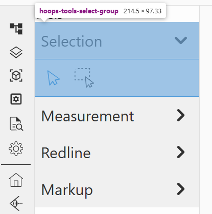
Link to the
WebVieweris internally established through thehoops-web-viewer-context-manager.
-
<hoops-tools-measurement-group> A section component for the tools panel that provides buttons to enable the different measurements operators.
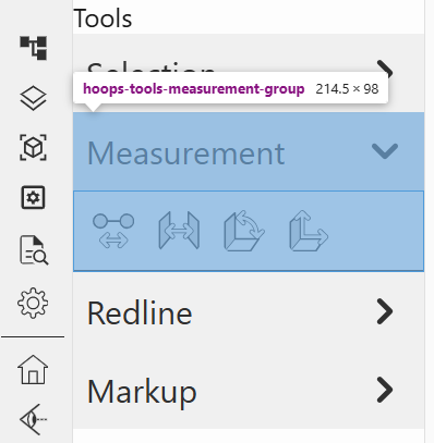
Link to the
WebVieweris internally established through thehoops-web-viewer-context-manager.
-
<hoops-tools-redline-group> A section component for the tools panel that provides buttons to enable the different redlines operators.
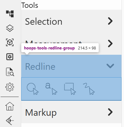
Link to the
WebVieweris internally established through thehoops-web-viewer-context-manager.
-
<hoops-tools-markup-group> A section component for the tools panel that provides buttons to enable the different markup operators and display the markup list.
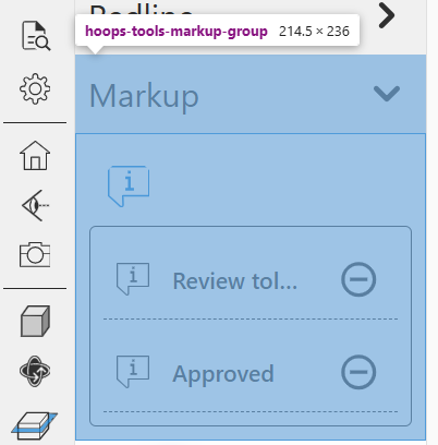
Link to the
WebVieweris internally established through thehoops-web-viewer-context-manager.
-
<hoops-ifc-relationship> A panel that displays the IFC relationships of the selected node.
Link to the
WebVieweris internally established through theIIFCRelationshipsService.
-
<hoops-service-registry> This component is used to ensure that the services are available throughout the application. It is an helper component, since the services can be registered manually as well.
The services can be overridden by passing a different service instance to the properties of the element.
The
<hoops-service-registry>component must be an ancestor of thehoops-web-viewer-context-managercomponent and other UI components to ensure that the services are available to them.
-
<hoops-settings-panel> A panel that provides various settings options for the viewer, including rendering, camera, and environment settings.
Link to the
WebVieweris internally established through different services provided by thehoops-service-registry.
-
<hoops-types-tree> Displays the generic types. Can be bound to the
WebViewer.model. Events are available for selection and visibility management, enhancing interaction with the model hierarchy.The component has no attributes, but the
HoopsTypesTreeElementclass has the following properties to configure and interact with the tree:selected: number[] - The list of selected node ids.model: IModel - The model to be displayed in the tree. This is typically theWebViewer.model.
Events
- ‘hoops-types-tree-node-click’:
TypesTreeNodeClickEvent - ‘hoops-types-tree-type-node-click’:
TypesTreeTypeNodeClickEvent - ‘hoops-types-tree-node-visibility-change’:
TypesTreeNodeVisibilityChangeEvent
UI Kit Tags
A modest yet essential UI kit has been created to support the development of the Web Components library and the demo app. This kit includes basic but necessary elements to ensure a cohesive and functional user interface. It provides simple UI elements that are more elaborate than a button, including a layout with menus and panels for containers, and a tree generic enough for all components to use.
-
<hoops-accordion> A collapsible component that allows you to group content in a way that can be expanded or collapsed.
The following slots are available to customize the accordion:
- ‘header’
- ‘toolbar’
- ‘icon’
- ‘content’
Attributes
expanded: boolean - Indicates whether the accordion is expanded.disabled: boolean - Indicates whether the accordion is disabled.level: number - The aria-level attribute for the heading element.
Events
- ‘change’: Triggered when the accordion is expanded or collapsed.
-
<hoops-layout> A comprehensive layout manager featuring top, down, right, and left panels, toolbars, a menu bar, a status bar, and a central widget. It provides a structured and organized interface for your application.
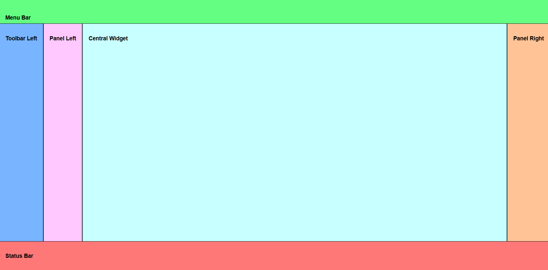
Use slot names to place the components in the desired location:
- ‘menu-bar’
- ‘status-bar’
- ‘panel-left’
- ‘panel-right’
- ‘panel-top’
- ‘panel-bottom’
- ‘toolbar-left’
- ‘toolbar-right’
- ‘toolbar-top’
- ‘toolbar-bottom’
- ‘central-widget’
Attributes
floatingPanels: boolean - If true, the panels will be displayed on top of the central widget.
-
<hoops-button> A customizable button component that can have an icon in the “icon” slot and anything in the default slot. It can be used to trigger actions or navigate within your application.

Attributes
tabindex: number.role: string - The role of the button, e.g., ‘button’, ‘menuitem’, etc.iconSize: ‘sm’ | ‘md’ | ‘xl’ - Specifies the size of the icon. Default is ‘md’.color: ‘default’ | ‘accent’ - Specifies the color state of the button. Default is ‘default’.disabled: boolean - If true, the button will be disabled and not clickable. Default is false.
-
<hoops-dropdown> A dropdown menu component that allows users to select from a list of options. It enhances the interactivity and usability of your application.
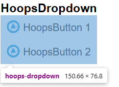
The dropdown button must be defined in the default slot. The dropdown content is defined in the “dropdown-popup” slot.
Attributes
preventCloseOnClickInside: boolean - If true, prevents the dropdown from closing when clicking inside it.position: ‘bottom’ | ‘top’ | ‘right’ | ‘left’ - Specifies the position of the dropdown relative to the host element. Default is ‘bottom’.anchor: ‘bottom’ | ‘top’ | ‘right’ | ‘left’ - Specifies the edge the dropdown is aligning to. Default is ‘left’.focusableSelector: string - CSS selector for focusable elements. Default isa[href], button, input, textarea, select, details, [tabindex]:not([tabindex="-1"]).disabled: boolean - If true, the dropdown is disabled. Default is false.
-
<hoops-icon> A web component that stores and manages all the icons used in your application. It ensures consistency and easy access to icons.
The list of available icons can be found in
icons.ts.Attributes
icon: string - The name of the icon to be displayed.
-
<hoops-icon-button> A button component that includes only an icon. It combines visual appeal with functionality, making it easy for users to understand its purpose.
Icon is defined in the default slot.
Attributes
tabindex: string - The tabindex of the button. Default is ‘0’.role: string - The role of the button, e.g., ‘button’. Default is ‘button’.size: string - The size of the icon. Default is ‘md’.color: ‘default’ | ‘accent’ - The color state of the button. Default is ‘default’.disabled: boolean - If true, the button is disabled. Default is false.
-
<hoops-list> The hoops-list component is a generalist list view, controlled by the
ListContext. It is designed to display a list of items, allowing for selection and interaction.Attributes
The list hasn’t any attributes, but the
Listclass has the following properties to configure and interact with the list:selected: number[] - The list of selected item ids.list: ContextWrapper - The list context wrapper that provides the data for the list. SeeListContextfor the context.
-
<hoops-node-properties> A panel designed to display properties in a key-value format. It is useful for showing detailed information about selected items in your application.
Attributes
nodeId: number - The ID of the node whose properties will be displayed. This is typically the ID of the selected node.node: INodePropertyAdapter - The node property adapter that provides the properties for the node. TheINodePropertyAdapterhas a model property to bind theWebViewer.model.
-
<hoops-toolbar> A basic vertical toolbar that allows you to stack buttons. It provides a convenient way to group and organize tools and actions.
Content of the toolbar is defined in the default slot.
-
<hoops-tree> The hoops-tree component is a generalist tree view, controlled by the
TreeContext. It is designed to display elements as a tree, allowing for selection and interaction.Attributes
selected: number[] - The list of selected item ids.tree: ContextWrapper - The tree context wrapper that provides the data for the tree. SeeTreeContextfor the context.
-
<hoops-separator> A separator component used to visually divide groups or elements. It helps in organizing visual items. Can be used in the toolbar or the dropdown for example.
Attributes
direction: ‘horizontal’ | ‘vertical’ - Specifies the orientation of the separator. Default is ‘horizontal’.
-
<hoops-switch> A toggle switch component that allows users to switch between two states on/off.

Attributes
checked: boolean - The switch state.disabled: boolean - Whether or not the switch is disabled.label: string - The switch label.
Events:
- ‘change’: Triggered when the switch state changes.
React Adapters
The React adapters are designed to make possible the integration of our Web Components into React applications. They wrap the Web Components and handle event management, ensuring that the components work seamlessly within the React ecosystem.
UI kit-react: Will wrap components of the UI kit:
web-viewer-components-react: Will wrap components of the web-viewer-components:
Services
-
ICameraService Service to manage camera operations in the Web Viewer.
Methods
getProjectionMode(): ProjectionsetProjectionMode(projectionMode: Projection): voidgetOrbitFallbackMode(): OrbitFallbackModesetOrbitFallbackMode(fallbackMode: OrbitFallbackMode): voidresetConfiguration(obj?: object): Promise<void>
Events
hoops-projection-mode-changedhoops-orbit-fallback-mode-changedhoops-camera-service-reset
-
ICuttingService Service to manage cutting feature of the Web Viewer. Provides methods to interface the cutting manager for controlling cutting sections, planes and capping geometry settings.
Methods
getCappingGeometryVisibility(): booleansetCappingGeometryVisibility(cappingGeometryVisibility: boolean): Promise<void>getCappingFaceColor(): string | undefinedsetCappingFaceColor(color?: string): Promise<void>getCappingLineColor(): string | undefinedsetCappingLineColor(color?: string): Promise<void>resetConfiguration(obj?: object): Promise<void>
Events
hoops-cutting-service-resethoops-capping-geometry-visibility-changedhoops-capping-face-color-changedhoops-capping-line-color-changed
-
IExplodeService Service to manage explode feature of the Web Viewer. Provides methods to interface with the explode manager for controlling part explosion effects.
Methods
reset(): voidstart(nodeIds?: number[], explosionVector?: IPoint3): Promise<void>setMagnitude(magnitude: number): Promise<void>stop(): Promise<void>getMagnitude(): numbergetActive(): boolean
Events
hoops-explode-service-resethoops-explode-startedhoops-explode-magnitude-changedhoops-explode-stopped
-
IFloorplanService Service to manage floorplan feature of the Web Viewer. Provides methods to control the floorplan overlay functionality including camera tracking, orientation, and visual settings.
Methods
isActive(): booleansetActive(active: boolean): Promise<void>isTrackCameraEnabled(): booleansetTrackCameraEnabled(enabled: boolean): Promise<void>getOrientation(): OrientationNamesetOrientation(orientation: OrientationName): Promise<void>getAutoActivationMode(): AutoActivationModeNamesetAutoActivationMode(mode: AutoActivationModeName): Promise<void>getOverlayFeetPerPixel(): numbersetOverlayFeetPerPixel(feetPerPixel: number): Promise<void>getOverlayZoomLevel(): numbersetOverlayZoomLevel(zoomLevel: number): Promise<void>getOverlayBackgroundOpacity(): numbersetOverlayBackgroundOpacity(opacity: number): Promise<void>getOverlayBorderOpacity(): numbersetOverlayBorderOpacity(opacity: number): Promise<void>getOverlayAvatarOpacity(): numbersetOverlayAvatarOpacity(opacity: number): Promise<void>getFloorplanBackgroundColor(): stringsetFloorplanBackgroundColor(color: string): Promise<void>getFloorplanBorderColor(): stringsetFloorplanBorderColor(color: string): Promise<void>getFloorplanAvatarColor(): stringsetFloorplanAvatarColor(color: string): Promise<void>getFloorplanAvatarOutlineColor(): stringsetFloorplanAvatarOutlineColor(color: string): Promise<void>resetConfiguration(obj?: object): Promise<void>
Events
hoops-floorplan-manager-resethoops-floorplan-activation-changedhoops-floorplan-track-camera-changedhoops-floorplan-orientation-changedhoops-floorplan-auto-activation-changedhoops-floorplan-overlay-feet-per-pixel-changedhoops-floorplan-overlay-zoom-level-changedhoops-floorplan-overlay-background-opacity-changedhoops-floorplan-overlay-border-opacity-changedhoops-floorplan-overlay-avatar-opacity-changedhoops-floorplan-background-color-changedhoops-floorplan-border-color-changedhoops-floorplan-avatar-color-changedhoops-floorplan-avatar-outline-color-changed
-
IIFCRelationshipsService Service to manage IFC relationships display in the Web Viewer. Provides methods to access relationship data for BIM models.
Properties
selectionRelationships: RelationshipData[]- Array of relationship data for the current selection
Methods
selectNode(nodeId: NodeId): void
Events
hoops-selection-ifc-relationships-changed
-
IMeasurementService Service to manage measurements in the Web Viewer. Provides methods to control measurement markup display and styling.
Properties
measurements: MeasureMarkup[]- Array of current measurement markups
Methods
removeMeasurement(measurement: MeasureMarkup): voidgetMeasurementColor(): stringsetMeasurementColor(color: string): voidresetConfiguration(obj?: object): Promise<void>
Events
hoops-measurement-updatedhoops-measurement-color-changedhoops-measurement-reset
-
INoteTextService Service to manage note text markup in the Web Viewer. Provides methods to control note text display and management.
Methods
getNoteTexts(): NoteTextItemData[]getNoteText(uniqueId: Uuid): NoteTextItemData | undefinedgetNoteTextKeys(): Uuid[]getActiveNoteTextKey(): Uuid | undefinedsetActiveNoteText(uniqueId: Uuid): Promise<boolean>getActiveNoteText(): NoteTextItemData | undefinedremoveNoteText(item: NoteTextItemData): Promise<void>
Events
hoops-note-text-createdhoops-note-text-deletedhoops-note-text-updatedhoops-note-text-hiddenhoops-note-text-shownhoops-note-text-manager-reset
-
IPmiService Service to manage PMI (Product Manufacturing Information) display in the Web Viewer. Provides methods to control PMI color and visibility settings.
Methods
getPmiColor(): stringsetPmiColor(color: string): voidgetPmiColorOverride(): booleansetPmiColorOverride(enableOverride: boolean, rootId?: NodeId): Promise<void>resetConfiguration(obj?: object): Promise<void>
Events
hoops-pmi-service-resethoops-pmi-color-changedhoops-pmi-color-override-changed
-
IRedlineService Service to manage redline markup in the Web Viewer. Provides methods to control redline views and markup items.
Methods
getRedlineViews(): RedlineViewData[]getRedlineView(uniqueId: Uuid): RedlineViewData | undefinedgetRedlineViewKeys(): Uuid[]getActiveViewKey(): Uuid | undefinedsetActiveView(uniqueId: Uuid): Promise<boolean>getActiveView(): RedlineViewData | undefinedremoveRedlineItem(viewId: Uuid, item: RedlineItemData): Promise<void>removeRedlineView(uniqueId: Uuid): void
Events
hoops-redline-createdhoops-redline-deletedhoops-redline-view-deletedhoops-markup-view-activatedhoops-redline-service-reset
-
IRenderOptionsService Service to manage rendering options in the Web Viewer. Provides comprehensive control over visual rendering settings including lighting, effects, and material properties.
Methods
getMinimumFramerate(): Promise<number>setMinimumFramerate(value: number): Promise<void>getHiddenLineOpacity(): numbersetHiddenLineOpacity(opacity: number): voidgetShowBackfaces(): booleansetShowBackfaces(show: boolean): Promise<void>getAmbientOcclusionEnabled(): booleansetAmbientOcclusionEnabled(enabled: boolean): Promise<void>getAmbientOcclusionRadius(): numbersetAmbientOcclusionRadius(radius: number): Promise<void>getAntiAliasingEnabled(): booleansetAntiAliasingEnabled(enabled: boolean): Promise<void>getBloomEnabled(): booleansetBloomEnabled(enabled: boolean): voidgetBloomIntensity(): numbersetBloomIntensity(intensity: number): voidgetBloomThreshold(): numbersetBloomThreshold(threshold: number): voidgetSilhouetteEnabled(): booleansetSilhouetteEnabled(enabled: boolean): voidgetReflectionEnabled(): booleansetReflectionEnabled(enabled: boolean): voidgetShadowEnabled(): booleansetShadowEnabled(enabled: boolean): voidgetShadowInteractive(): booleansetShadowInteractive(interactive: boolean): voidgetShadowBlurSamples(): numbersetShadowBlurSamples(samples: number): voidgetSplatRenderingEnabled(): booleansetSplatRenderingEnabled(enabled: boolean): Promise<void>getSplatRenderingSize(): numbersetSplatRenderingSize(size: number): Promise<void>getSplatRenderingPointSizeUnit(): PointSizeUnitsetSplatRenderingPointSizeUnit(unit: PointSizeUnit): Promise<void>getEyeDomeLightingEnabled(): Promise<boolean>setEyeDomeLightingEnabled(enabled: boolean): Promise<void>getBackgroundColor(): VerticalGradientsetBackgroundColor(color: VerticalGradient): Promise<void>resetConfiguration(obj?: object): Promise<void>
Events:
hoops-render-options-service-resethoops-minimum-framerate-changedhoops-hidden-line-opacity-changedhoops-show-backfaces-changedhoops-ambient-occlusion-enabled-changedhoops-ambient-occlusion-radius-changedhoops-anti-aliasing-enabled-changedhoops-bloom-enabled-changedhoops-bloom-intensity-changedhoops-bloom-threshold-changedhoops-silhouette-enabled-changedhoops-reflection-enabled-changedhoops-shadow-enabled-changedhoops-shadow-interactive-changedhoops-shadow-blur-samples-changedhoops-splat-rendering-enabled-changedhoops-splat-rendering-size-changedhoops-splat-rendering-point-size-unit-changedhoops-eye-dome-lighting-enabled-changedhoops-background-color-changed
-
ISelectionService Service to manage selection behavior in the Web Viewer. Provides methods to control selection appearance and behavior settings.
Methods
getEnableFaceLineSelection(): booleansetEnableFaceLineSelection(enableFaceLineSelection: boolean): Promise<void>getHonorsSceneVisibility(): booleansetHonorsSceneVisibility(honorsSceneVisibility: boolean): voidgetBodyColor(): stringsetBodyColor(color: string): Promise<void>getFaceAndLineColor(): stringsetFaceAndLineColor(color: string): Promise<void>resetConfiguration(obj?: object): Promise<void>
Events
hoops-selection-service-resethoops-enable-face-line-selection-changedhoops-honors-scene-visibility-changedhoops-body-color-changedhoops-face-and-line-color-changed
-
ISheetService Service to manage sheet display in the Web Viewer. Provides methods to control sheet background, colors, and shadow settings for drawing sheets.
Methods
getSheetBackgroundColor(): stringgetSheetColor(): stringgetSheetShadowColor(): stringsetSheetColors(backgroundColor: string, sheetColor: string, sheetShadowColor: string): Promise<void>getBackgroundSheetEnabled(): booleansetBackgroundSheetEnabled(enabled: boolean): Promise<void>resetConfiguration(obj?: object): Promise<void>
Events
hoops-sheet-service-resethoops-sheet-colors-changedhoops-background-sheet-enabled-changed
-
ISpaceMouseService Service to manage Space Mouse integration in the Web Viewer. Provides methods to connect and control 3D navigation devices.
Methods
connect(): void- Connect to the space mouse. To be successful, the canvas where the mouse is to be used must have focus. Note: If this is called but the 3d connexion software is not running, a connection error will be shown in the console.
Events
hoops-spacemouse-connected
-
IViewService Service to manage view controls in the Web Viewer. Provides methods to control navigation aids like axis triad and nav cube visibility.
Methods
isAxisTriadVisible(): booleansetAxisTriadVisible(visible: boolean): voidisNavCubeVisible(): booleansetNavCubeVisible(visible: boolean): void
Events
hoops-view-resethoops-view-axis-triad-visibility-changedhoops-view-nav-cube-visibility-changedhoops-view-service-reset
-
IWalkOperatorService Service to manage walk navigation mode in the Web Viewer. Provides comprehensive control over walk mode settings including movement speeds, mouse look, and collision detection.
Methods
getWalkMode(): WalkModeNamesetWalkMode(mode: WalkModeName): Promise<void>getRotationSpeed(): numbersetRotationSpeed(speed: number): voidgetWalkSpeed(): numbersetWalkSpeed(speed: number): voidgetElevationSpeed(): numbersetElevationSpeed(speed: number): voidgetFieldOfView(): numbersetFieldOfView(fov: number): voidisMouseLookEnabled(): booleansetMouseLookEnabled(enabled: boolean): voidgetMouseLookSpeed(): numbersetMouseLookSpeed(speed: number): voidisCollisionDetectionEnabled(): booleansetCollisionDetectionEnabled(enabled: boolean): Promise<void>resetConfiguration(obj?: object): Promise<void>
Events
hoops-walk-mode-operator-resethoops-mouse-walk-operator-resethoops-keyboard-walk-operator-resethoops-operators-walk-mode-changedhoops-operators-walk-rotation-speed-changedhoops-operators-walk-speed-changedhoops-operators-elevation-speed-changedhoops-operators-field-of-view-changedhoops-operators-mouse-look-enabled-changedhoops-operators-mouse-look-speed-changedhoops-operators-collision-detection-changed